
Customize HTML rendering
Customize HTML rendering
The fragment comes with its own stylesheet, linked at the top of the fragment. It provides a clean, accessible layout.
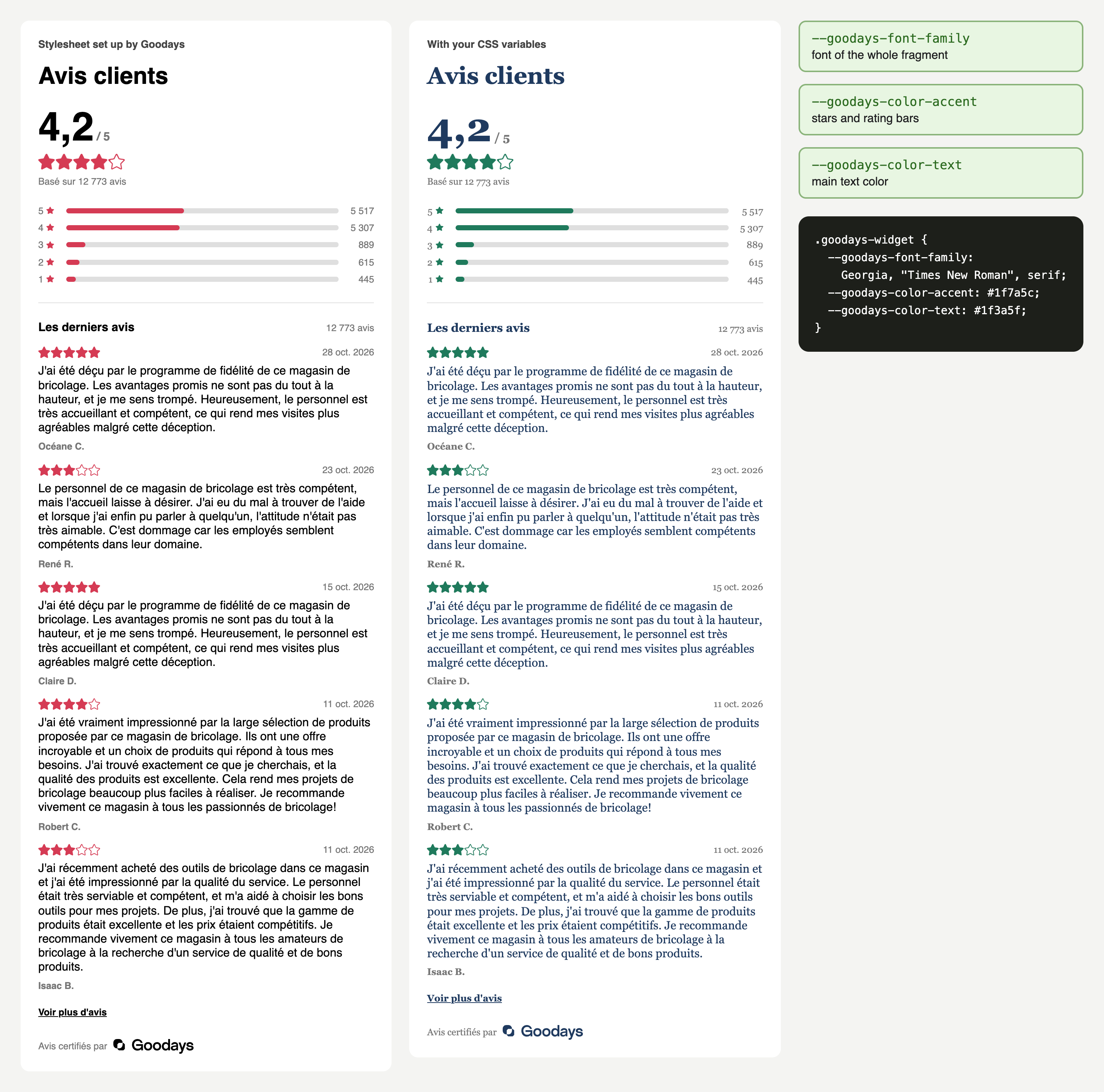
By default, Goodays adapts this stylesheet to your website. If you want to make other changes on your own, without going through Goodays, you can also override the fragment's CSS variables:
| Option | Who does it | Best for |
|---|---|---|
| Brand stylesheet | Goodays, by default | A theme matching your brand guidelines, applied to all your points of sale |
| Override CSS variables | Your team, optional | Other changes on your own: colors, font, sizes and spacing, from your own stylesheet |
Brand stylesheet
By default, Goodays sets up a stylesheet tailored to your brand guidelines. It is applied to every fragment of your account, with no change on your side. Your Goodays project contact handles it with you.
Override CSS variables
Optional: use CSS variables to make other changes on your own, without going through Goodays.
All the fragment's design tokens are CSS custom properties, prefixed with --goodays-. The fragment stylesheet declares them with zero specificity (:where(.goodays-widget)), so a simple rule in your own stylesheet wins, with no !important and whatever the loading order:
.goodays-widget {
  --goodays-font-family: "Inter", sans-serif;
  --goodays-color-text: #14211f;
  --goodays-color-muted: #5b6b68;
  --goodays-color-accent: #e8912d;   /* fill of stars and rating bars */
  --goodays-color-border: #dfe6e4;
  --goodays-gap-md: 20px;            /* scales every spacing */
}
Available variables
| Variable | Default | Used for |
|---|---|---|
--goodays-font-family | inherit | Font of the whole fragment (your page font by default) |
--goodays-font-size | 1rem | Base font size; other sizes are relative to it |
--goodays-font-size-sm | 0.8em | Dates, authors, counts, labels |
--goodays-font-size-md | 1em | Comments, section titles |
--goodays-font-size-title | 2em | "Customer reviews" heading |
--goodays-font-size-score | 3.4em | Average score |
--goodays-line-height | 1.2 | Default line height |
--goodays-line-height-tight | 1 | Average score line height |
--goodays-font-weight-bold | 700 | Bold texts |
--goodays-gap-md | 16px | Base spacing; xs, sm and lg derive from it |
--goodays-gap-xs | calc(var(--goodays-gap-md) / 4) | Extra-small spacing |
--goodays-gap-sm | calc(var(--goodays-gap-md) / 2) | Small spacing |
--goodays-gap-lg | calc(var(--goodays-gap-md) * 3 / 2) | Large spacing |
--goodays-color-page-background | white | Background of your page, shown inside empty stars. The fragment itself stays transparent |
--goodays-color-text | #000000 | Main text, logo |
--goodays-color-muted | #767676 | Secondary texts |
--goodays-color-accent | #000000 | Fill of filled stars and rating bars |
--goodays-color-accessible-accent | var(--goodays-color-accent) | Outline of stars and rating bars. Set it when your accent is too light to contrast with your page background |
--goodays-color-border | #dfdfdf | Divider, rating bar tracks |
--goodays-stars-color-filled | var(--goodays-color-accent) | Fill of filled stars |
--goodays-stars-color-filled-border | var(--goodays-color-accessible-accent) | Outline of filled stars |
--goodays-stars-color-empty | var(--goodays-color-page-background) | Fill of empty stars |
--goodays-stars-color-empty-border | var(--goodays-color-accessible-accent) | Outline of empty stars |
--goodays-bar-color-filled | var(--goodays-color-accent) | Fill of the filled part of rating bars |
--goodays-bar-color-filled-border | var(--goodays-color-accessible-accent) | Outline of the filled part of rating bars |
--goodays-bar-color-empty | var(--goodays-color-border) | Rating bar tracks |
--goodays-bar-color-empty-border | var(--goodays-color-border) | Outline of rating bar tracks |
--goodays-stars-size-sm | 0.8em | Star next to distribution labels |
--goodays-stars-size-md | 1em | Stars of each review |
--goodays-stars-size-lg | 1.4em | Stars of the average score |
--goodays-distribution-bar-height | 7px | Height of the rating distribution bars |
Custom star shapeStars are drawn with two CSS masks:
--goodays-stars-mask-outeris the whole star and gets the outline color,--goodays-stars-mask-inneris the shape inside the outline and gets the fill color. To use another shape, override both with SVG images and adjust--goodays-stars-mask-width,--goodays-stars-mask-heightand--goodays-stars-mask-gap(defaults16,16and1). Both SVGs must use the sameviewBox, equal to (width + gap) × height, and the inner shape must fit inside the outer one.
Class reference
Use these classes to target specific elements, for example to adjust a margin or a border. HTML IDs have an automatically generated suffix that can change when the fragment is regenerated: target classes or CSS variables instead of hard-coding IDs. The visible heading is "Customer reviews", translated into the place's language; the place name is included in the JSON-LD, not repeated in the widget heading.
section.goodays-widget                      root, also a CSS container
├── header.goodays-summary
│   ├── h2.goodays-title                    "Customer reviews"
│   ├── div.goodays-summary-body
│   │   ├── div.goodays-score
│   │   │   ├── div.goodays-score-line      .goodays-score-value + .goodays-score-max
│   │   │   ├── div.goodays-stars.goodays-stars-lg
│   │   │   └── p.goodays-review-count
│   │   └── div.goodays-distribution
│   │       └── div.goodays-distribution-row × 5
│   │           ├── span.goodays-distribution-label   with span.goodays-star
│   │           ├── meter.goodays-distribution-bar
│   │           └── span.goodays-distribution-count
│   └── p.goodays-empty-state               instead of the summary body, when there is no review yet
├── hr.goodays-divider
├── section.goodays-reviews
│   ├── div.goodays-section-heading         h3.goodays-section-title + span.goodays-section-count
│   ├── ol.goodays-review-list
│   │   └── li.goodays-review-item
│   │       └── article.goodays-review
│   │           ├── div.goodays-review-topline   div.goodays-stars + time.goodays-review-date
│   │           ├── p.goodays-review-comment
│   │           └── p.goodays-review-author
│   └── button.goodays-reviews-toggle       "See more reviews", when there are more than 5 reviews
└── footer.goodays-widget-footer span.goodays-certified + svg.goodays-logo/* Example: card layout for each review */
.goodays-widget .goodays-review {
padding: 16px;
border: 1px solid var(--goodays-color-border);
border-radius: 12px;
}Responsive behavior. The fragment adapts to the width of its container, not the viewport: below 580px, the score and the distribution stack vertically. Place it in a column of any width.
Accessibility. The fragment uses semantic markup, ARIA labels and visually hidden texts, and supports forced-colors mode. Keep sufficient contrast when you change colors: 4.5:1 for texts against your page background, and 3:1 for star outlines against your page background and between filled and empty stars. If your page background is not white, set --goodays-color-page-background to match it.
What not to change
Keep the content visible and unmodified
- Don't edit, reorder or remove parts of the HTML or the JSON-LD block. Change the appearance with CSS only.
- Don't permanently hide reviews from visitors while keeping them for crawlers, for example with
display: noneor off-screen positioning. Search engines treat content shown to crawlers but hidden from users as cloaking. The built-in "See more reviews" button is supported: it initially displays the first 5 reviews and lets visitors reveal every review.- Keep the "Reviews certified by Goodays" footer visible.
If you remove the stylesheet <link> from the fragment, you are responsible for all its styling. Prefer overriding CSS variables: your customizations keep working when the layout is improved.
Updated about 1 hour ago